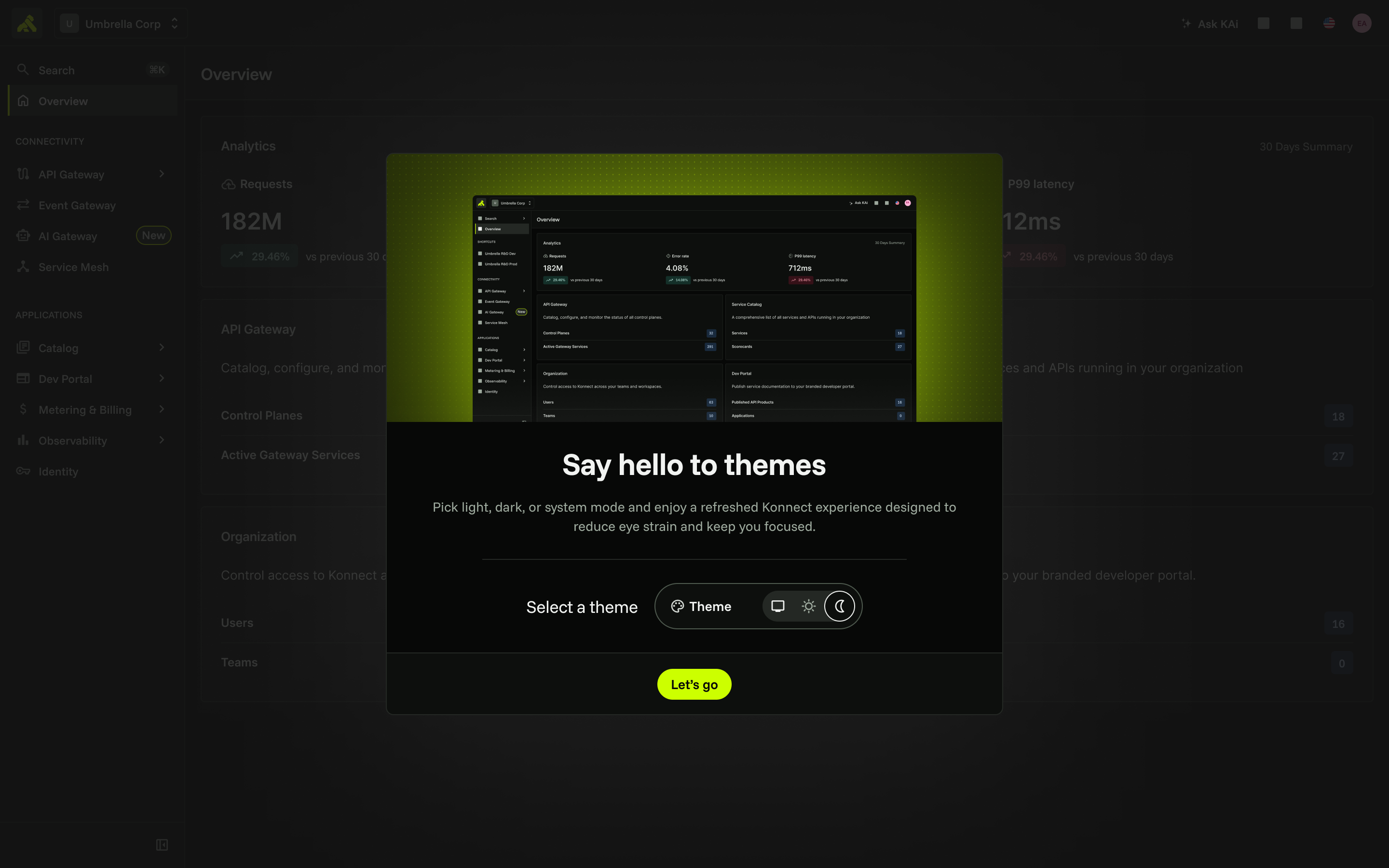
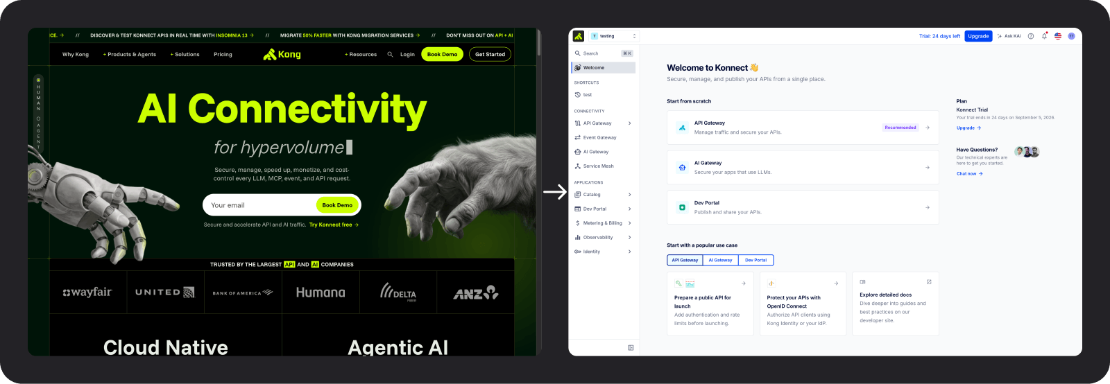
Visual changes
With the system capable of change, we still had to make the visual language feel intentional. The new brand could not simply be applied everywhere; it had to earn its place in the interface. One of the biggest challenges was introducing the new brand color into the product. Because it had very low contrast against white, it couldn’t be used broadly across components. Instead, we treated it as a deliberate accent, finding targeted ways to bring the brand into the experience without compromising usability or accessibility.
Logo
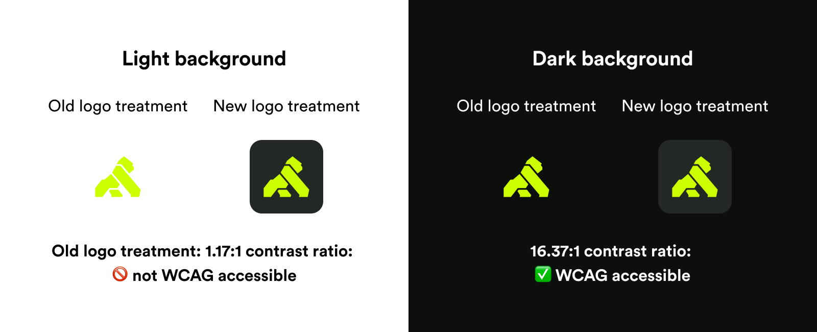
The new green logo introduced an accessibility challenge because it no longer had sufficient contrast on light backgrounds. To solve this consistently across themes, I placed the logo on a dark background that preserved contrast and brand visibility in both light and dark modes.
Buttons
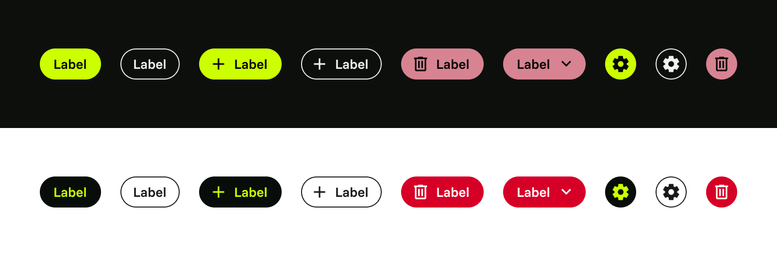
We wanted primary buttons to become one of the most prominent expressions of the new brand color. In dark mode, the green already provided sufficient contrast. In light mode, we inverted the treatment, using a dark button background with green text to maintain a strong brand presence while meeting accessibility requirements.
Badges and messages
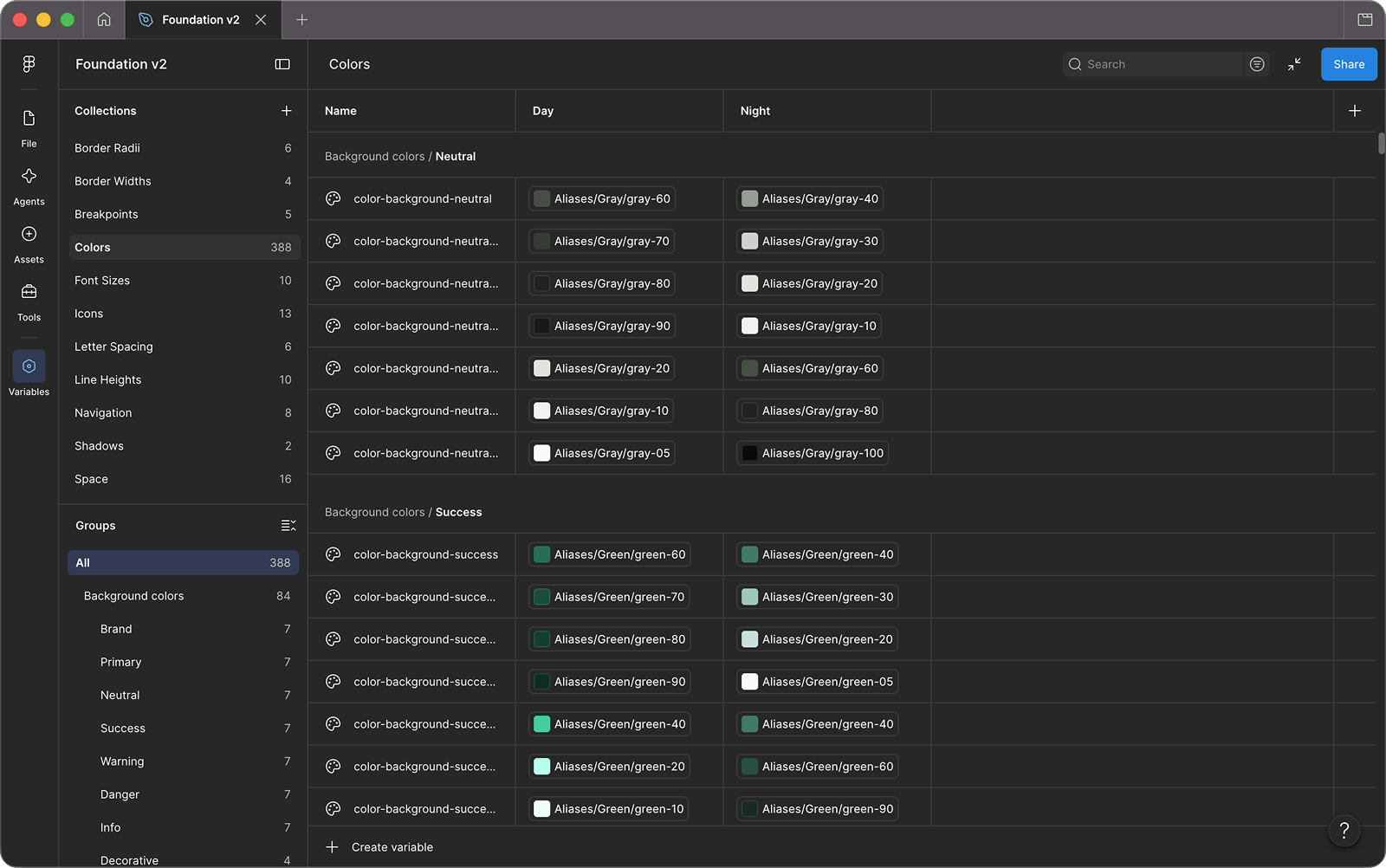
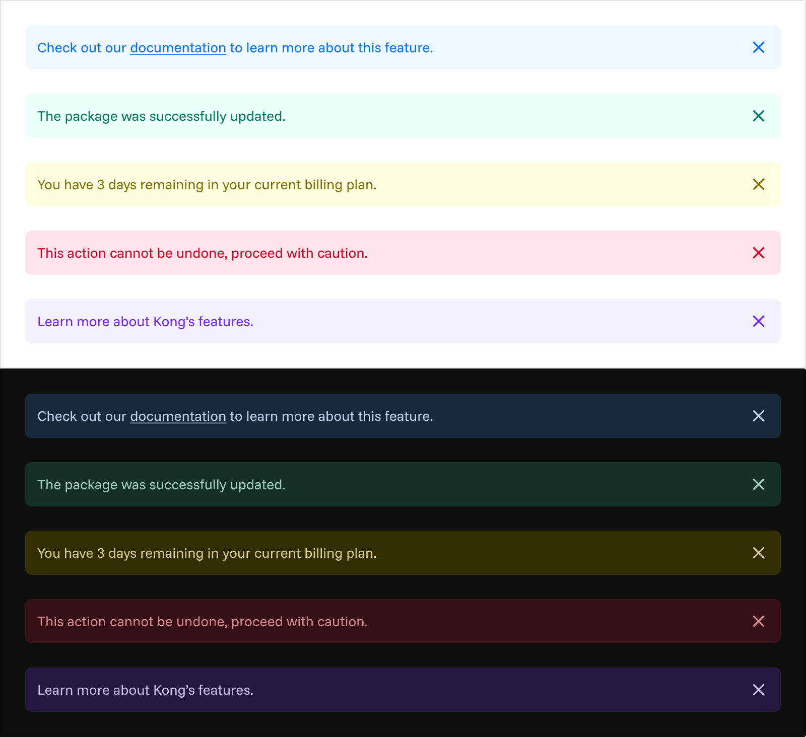
Our existing palette used highly saturated colors, particularly in badges and messaging. While they worked well in light mode, they felt overly bright and intense on dark surfaces. Rather than compromise both themes, I introduced a separate set of color-aliased tokens for dark mode, allowing each experience to feel intentional while preserving a consistent visual language across the system.

Other changes
In addition to these changes, there were many refinements applied system-wide, to specific components, and to our navigation.
 Kong
Kong 2026
2026